
Photo / Courtesy Maine Association of Realtors
Jeff Harris
Please do not leave this page until complete. This can take a few moments.
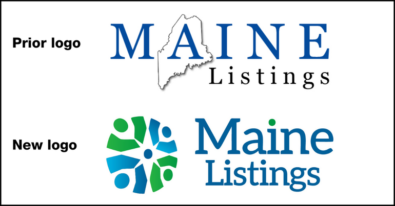 Image / Courtesy Maine Listings
Seen here is the old versus new logo, with a slightly off-center circle, green and blue tones and a star formed by the white space at the center.
Image / Courtesy Maine Listings
Seen here is the old versus new logo, with a slightly off-center circle, green and blue tones and a star formed by the white space at the center.
Maine Listings, a real estate data and technology multiple listing service operated by the Maine Association of Realtors, unveiled a new logo and visual direction that aims to reflect its mission to be customer-centric, friendly and accessible.
“This is about more than a logo,” said Jeff Harris, the association’s president. "It's about aligning our culture, communications and customer experience.”
Maine Listings serves 6,800 real estate professionals.
“We’re committed to redefining what customer-centricity looks like, as our commitment to customer success is our north star,” said Denise Libby, CEO of Maine Listings.

The new brand, she said, is “a visual symbol of how we blend rural beauty and hometown values with modern technology, always putting people first.”
The rebranding is part of a larger initiative to invest in best-in-class technologies, broker support and customer service.
Maine Listings recently won recognition by sweeping “Best MLS” honors in all seven categories of customer experience index in a survey earlier this year by California real estate consultant WAV Group.
The logo was designed to tell a story, the association said.
A slightly off-center circle represents movement and progress, a nod to the organization's evolution and its role in helping customers advance in their careers and transactions.
The circular motif represents people, customers and homes, with the idea of capturing a sense of community in Maine's diverse geographies.
Green and blue tones reflect Maine’s oceans, lakes, forests and mountains.
The white space at the center forms a star, symbolizing the idea that Maine Listings is a “north star” for customers.
The rebranding process involved staff, committee members and the board, and was facilitated by WAV Group, said Libby.
“The change also signals a renewed internal focus on storytelling, transparency and strategic communications to connect with all stakeholders, from real estate professionals to home buyers and sellers,” she added.
The Giving Guide helps nonprofits have the opportunity to showcase and differentiate their organizations so that businesses better understand how they can contribute to a nonprofit’s mission and work.
Learn More
Work for ME is a workforce development tool to help Maine’s employers target Maine’s emerging workforce. Work for ME highlights each industry, its impact on Maine’s economy, the jobs available to entry-level workers, the training and education needed to get a career started.
Learn More
Whether you’re a developer, financer, architect, or industry enthusiast, Groundbreaking Maine is crafted to be your go-to source for valuable insights in Maine’s real estate and construction community.
Learn moreThe Giving Guide helps nonprofits have the opportunity to showcase and differentiate their organizations so that businesses better understand how they can contribute to a nonprofit’s mission and work.
Work for ME is a workforce development tool to help Maine’s employers target Maine’s emerging workforce. Work for ME highlights each industry, its impact on Maine’s economy, the jobs available to entry-level workers, the training and education needed to get a career started.
Whether you’re a developer, financer, architect, or industry enthusiast, Groundbreaking Maine is crafted to be your go-to source for valuable insights in Maine’s real estate and construction community.
In order to use this feature, we need some information from you. You can also login or register for a free account.
By clicking submit you are agreeing to our cookie usage and Privacy Policy
Already have an account? Login
Already have an account? Login
Want to create an account? Register
In order to use this feature, we need some information from you. You can also login or register for a free account.
By clicking submit you are agreeing to our cookie usage and Privacy Policy
Already have an account? Login
Already have an account? Login
Want to create an account? Register
This website uses cookies to ensure you get the best experience on our website. Our privacy policy
To ensure the best experience on our website, articles cannot be read without allowing cookies. Please allow cookies to continue reading. Our privacy policy


0 Comments