
Courtesy / Woodhull
ConvenientMD’s new primary care clinic in Portsmouth, N.H., features an exterior wood scrim that patinas over time, balanced by native landscaping.
Please do not leave this page until complete. This can take a few moments.
 Courtesy / Woodhull
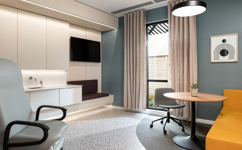
Exam room incorporate soft materials selected to be comfortable but easy to clean, with multiple seating and separate spots for accessories.
Courtesy / Woodhull
Exam room incorporate soft materials selected to be comfortable but easy to clean, with multiple seating and separate spots for accessories.
When Portland design firm Woodhull was recruited by ConvenientMD to plan its primary health care centers, the idea was to redefine spaces by blending aesthetics and functionality, while helping patients feel supported and comfortable during their visits.
Since beginning work with ConvenientMD two years ago, Woodhull has designed the health care chain’s first two primary care locations, at 211 Marginal Way in Portland and another in Portsmouth, N.H.
The result?
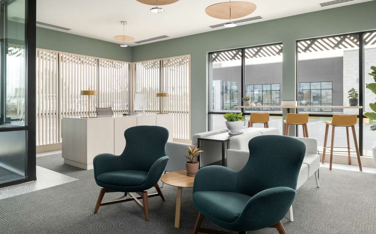
Abundant windows that incorporate lots of natural light. Soft textures, plants, natural white ash wood and pops of color. The exterior features a wood scrim that patinas over time, balanced by native landscaping visible from the patient rooms.
ConvenientMD, headquartered in Portsmouth, N.H., is known for its chain of urgent care clinics, which currently number over 40 and include nine in Maine. So primary care was a new direction.
“They wanted a different type of vision for health care,” Patrick Boothe, Woodhull’s commercial studio director, told Mainebiz.
This was Woodhull’s entry in the health care field. That lack of experience, said Boothe, helped lend a fresh perspective. Portsmouth was the prototype project.
“It was helpful that we were a little naïve,” said Boothe. “We hadn’t done health care.”

Woodhull worked closely with ConvenientMD to ensure the project met the functional requirements of a clinical setting.
On the aesthetic side, the team considered how the design could be optimized to improve patient experience.
“When we’re going to the doctor’s office, we’re probably sick, we’re probably nervous and a bit vulnerable,” he said. “We wanted people to feel protected and in control.”
The aim was to create inviting environments that promote a sense of ease and comfort, with the goal of changing people's perspectives about a trip to the doctor. The team prioritized elements that enhance the overall well-being of individuals seeking care.
The natural light is intended to ensure patients feel connected to their surroundings and can maintain an intuitive orientation within the building. The lighting and pops of color were incorporated to reduce the feeling of anxiety associated with visiting a health care facility.
“A lot of times, when you go to a typical doctor’s office, you go into the lobby that leads to a corridor with no windows and then to a room that might have a window or might not,” said Boothe. “You feel like you’re in a labyrinth, and you’re just waiting for the doctor to come.
“We tried to turn that on its head. The lobby is bright and open — which is what you normally see. Then there’s a glass wall so you can begin to see where you’re heading.”
The corridor and exam rooms all include windows that bring in natural light and provide views of the landscaping outside. The exam room windows have shades that the patient can control. Furnishings — typically plastics and laminates — instead incorporate soft materials that are selected to be more comfortable but still easy to clean. There are multiple seating options and separate spots to place accessories such as clothes, handbags, wallets and jewelry.
“We pushed for real wood for the cabinets,” said Boothe. “That’s something you don’t ever see. It’s an ash veneer, a tree that’s commonly found on the East Coast, with a subtle whitewash finish, so it feels a little more homey and warm.
“These are sublet things you don’t pick up on at a typical doctor’s office. But it does change the feel of someone’s understanding of the space.”
Woodhull has provided design guidelines for five of the locations.
“We’ll continue to advise them for additional locations,” said Boothe.
Other industries are looking for new design approaches, too. For example, in recent years Woodhull was contracted as the lead architect by SeaWeed Co. to design its adult-use cannabis retail shops in South Portland and Portland.
The Scandinavian-influenced design uses a modern style with warm materials and textures such as tile and natural wood, with the goal of creating a relaxing, clean and open feel for the new industry.
“It’s not about what’s new. It’s about what’s distinctive,” said Boothe. “It’s an optimistic view of your future. Maybe it pushes the envelope, maybe not, but it discovers something new and there’s beauty in that process.”

The Giving Guide helps nonprofits have the opportunity to showcase and differentiate their organizations so that businesses better understand how they can contribute to a nonprofit’s mission and work.
Learn More
Work for ME is a workforce development tool to help Maine’s employers target Maine’s emerging workforce. Work for ME highlights each industry, its impact on Maine’s economy, the jobs available to entry-level workers, the training and education needed to get a career started.
Learn More
Whether you’re a developer, financer, architect, or industry enthusiast, Groundbreaking Maine is crafted to be your go-to source for valuable insights in Maine’s real estate and construction community.
Learn moreThe Giving Guide helps nonprofits have the opportunity to showcase and differentiate their organizations so that businesses better understand how they can contribute to a nonprofit’s mission and work.
Work for ME is a workforce development tool to help Maine’s employers target Maine’s emerging workforce. Work for ME highlights each industry, its impact on Maine’s economy, the jobs available to entry-level workers, the training and education needed to get a career started.
Whether you’re a developer, financer, architect, or industry enthusiast, Groundbreaking Maine is crafted to be your go-to source for valuable insights in Maine’s real estate and construction community.
In order to use this feature, we need some information from you. You can also login or register for a free account.
By clicking submit you are agreeing to our cookie usage and Privacy Policy
Already have an account? Login
Already have an account? Login
Want to create an account? Register
In order to use this feature, we need some information from you. You can also login or register for a free account.
By clicking submit you are agreeing to our cookie usage and Privacy Policy
Already have an account? Login
Already have an account? Login
Want to create an account? Register
This website uses cookies to ensure you get the best experience on our website. Our privacy policy
To ensure the best experience on our website, articles cannot be read without allowing cookies. Please allow cookies to continue reading. Our privacy policy


0 Comments